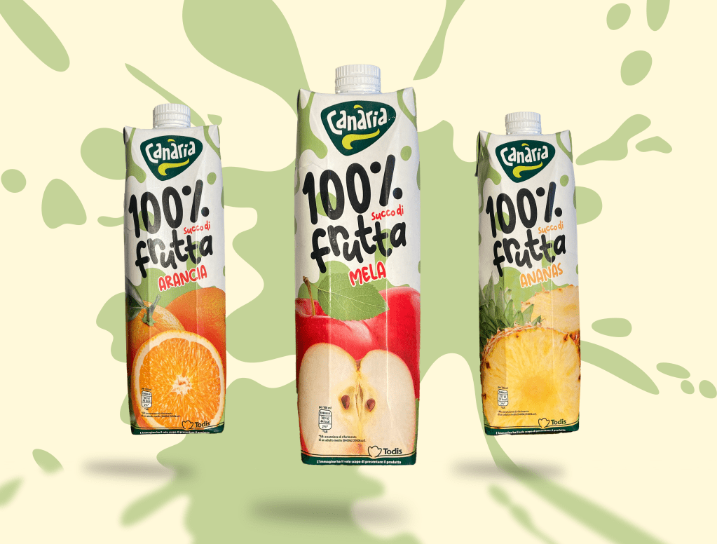
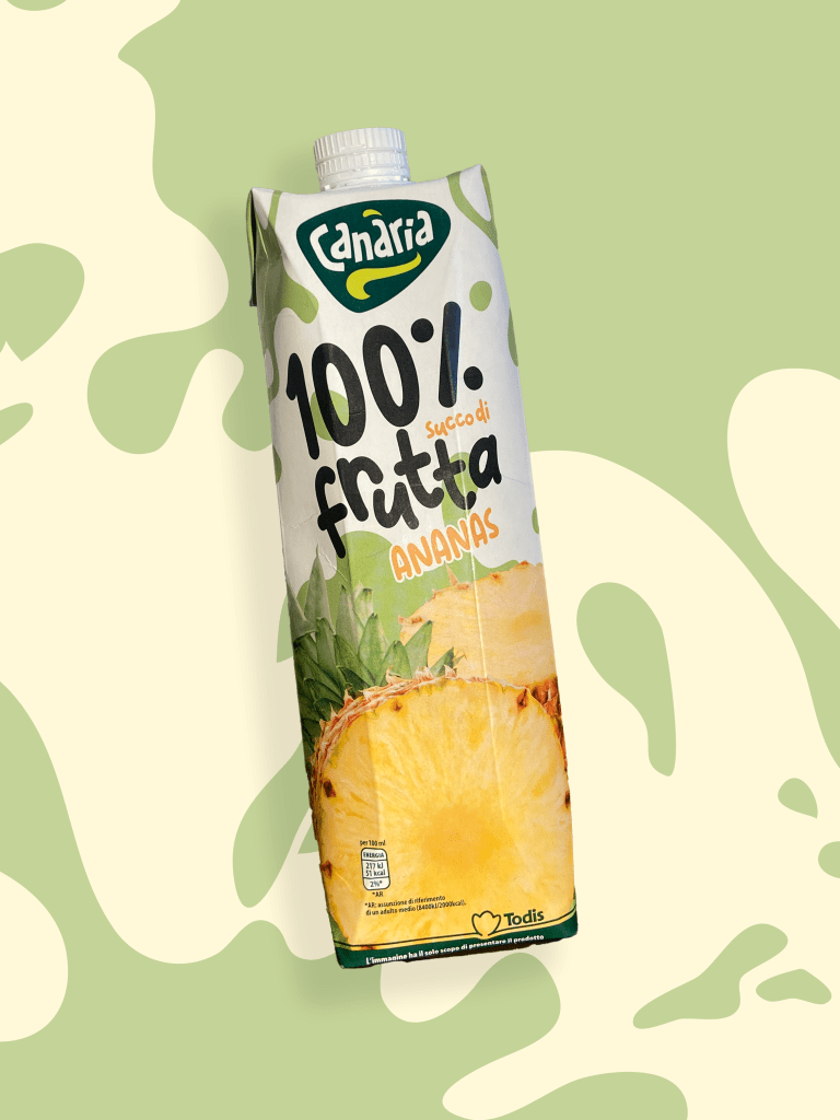
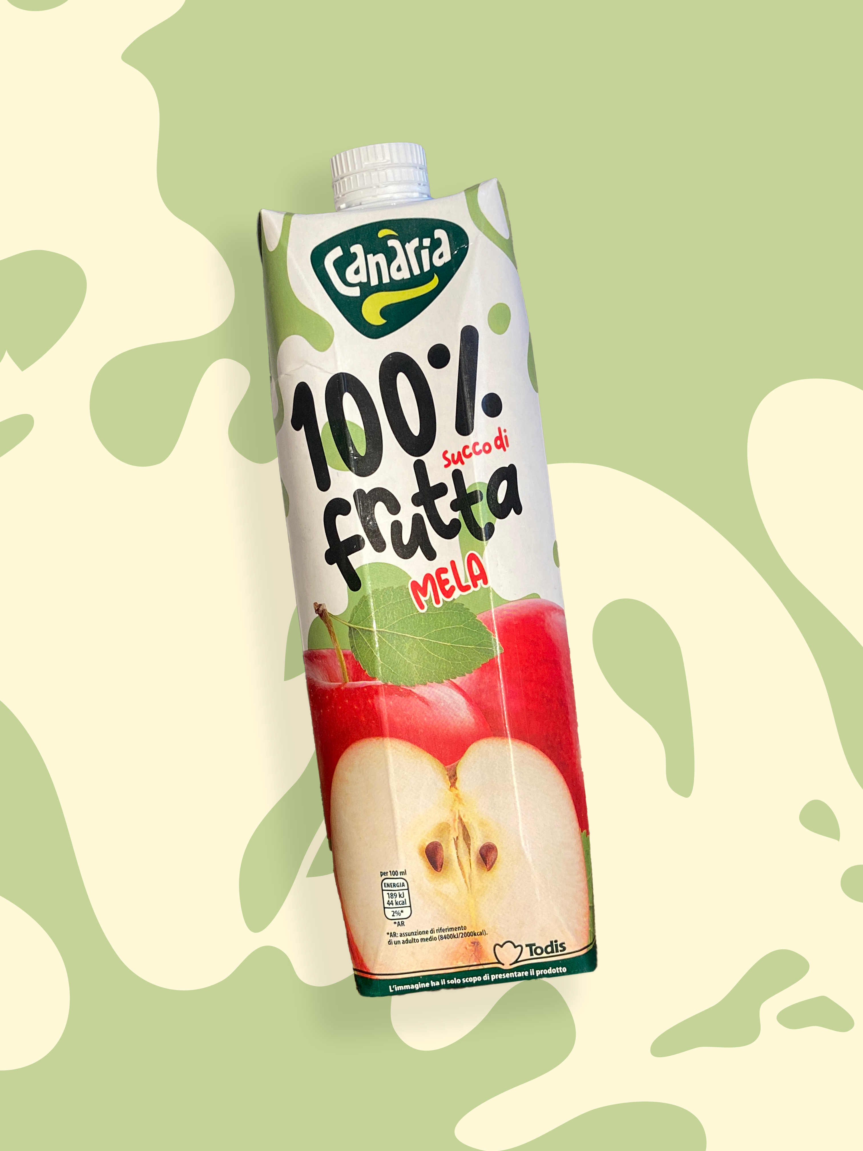
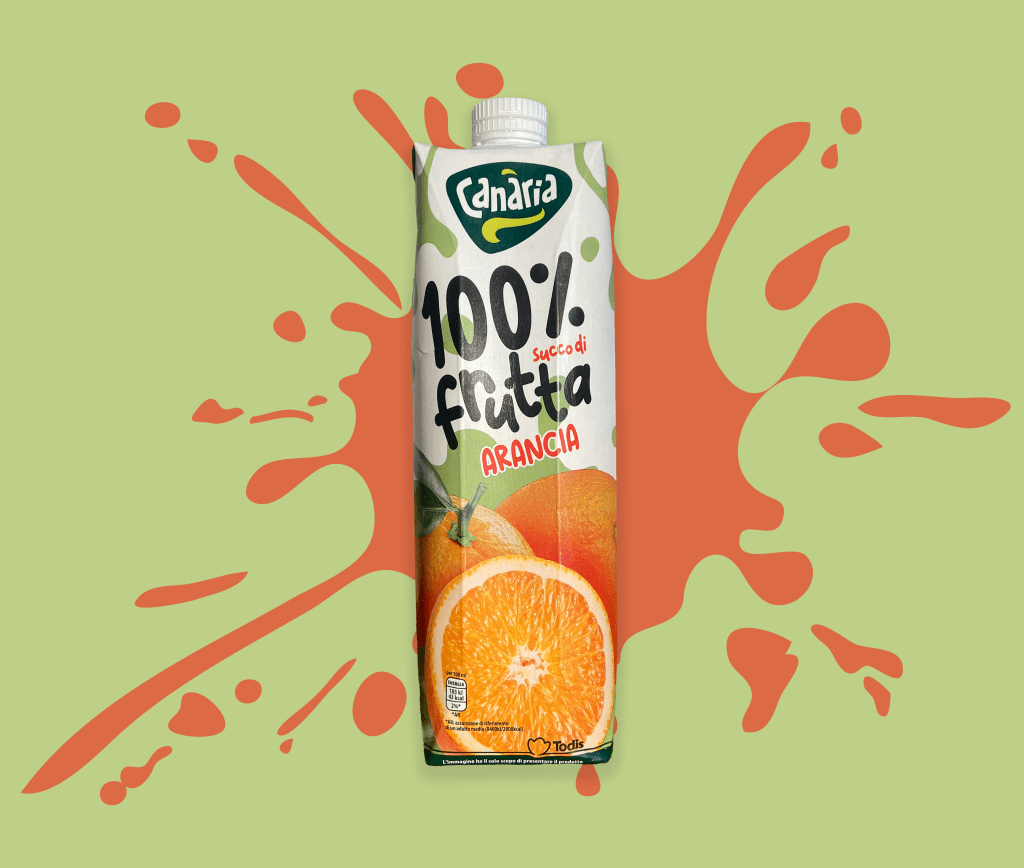
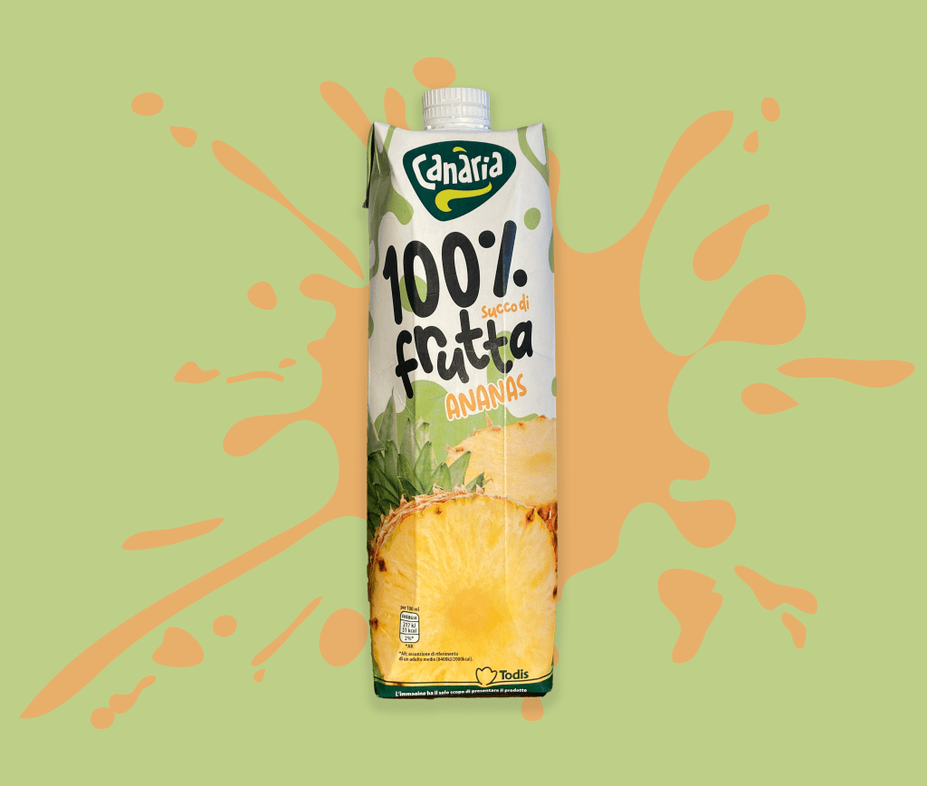
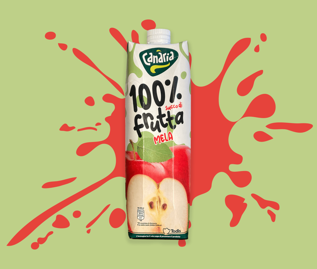
Todis canaria – 100% frutta

I collaborated with the visual art group agency in milan to redesign the canaria logo and the fruit juice line for todis supermarkets.
my goal was to create a new graphic design that made the product image more playful and highlighted the natural ingredients. the packaging is white, featuring juice splashes and minimalistic graphic lines that emphasize the freshness and quality of the fruit used.
the result is a fresh and vibrant design, perfect for capturing consumers’ attention.
section: packaging design, logo design. (restyling)
art direction: marco galardi e
marco bonfanti – visual art group
software used: adobe illustrator,
adobe photoshop.